Service times, easy to find
Times, address, and parking on the first screen: the information every newcomer needs, never three clicks deep.
People usually look at a church website before a first visit, often on a Saturday night, asking two things: when are services, and will I feel out of place? Pendro helps a congregation of any size answer both warmly, with a site volunteers can keep current without touching code.
Free plan forever. No credit card to start.
Service times a visitor can find in five seconds, sermons and news kept current by volunteers, and giving made simple.
Times, address, and parking on the first screen: the information every newcomer needs, never three clicks deep.
A first-visit section answering the anxious questions: what to wear, where children go, how long it lasts, whether you will be singled out.
Pages for the toddler group, the food pantry, and study groups, each findable by the neighbours searching for exactly that help.
“Anglican parish church in Durham, Sunday services at 9 and 11, toddler group and food pantry midweek”
You get a draft with service times findable in five seconds, the first-visit questions answered warmly, and an announcement bar for the week ahead.
It starts from a template made for the trade. Here that is Church / Faith Community, the one rendered live at the top of this page.
Write your own briefAn example, not a live demo. Nothing runs on this page.
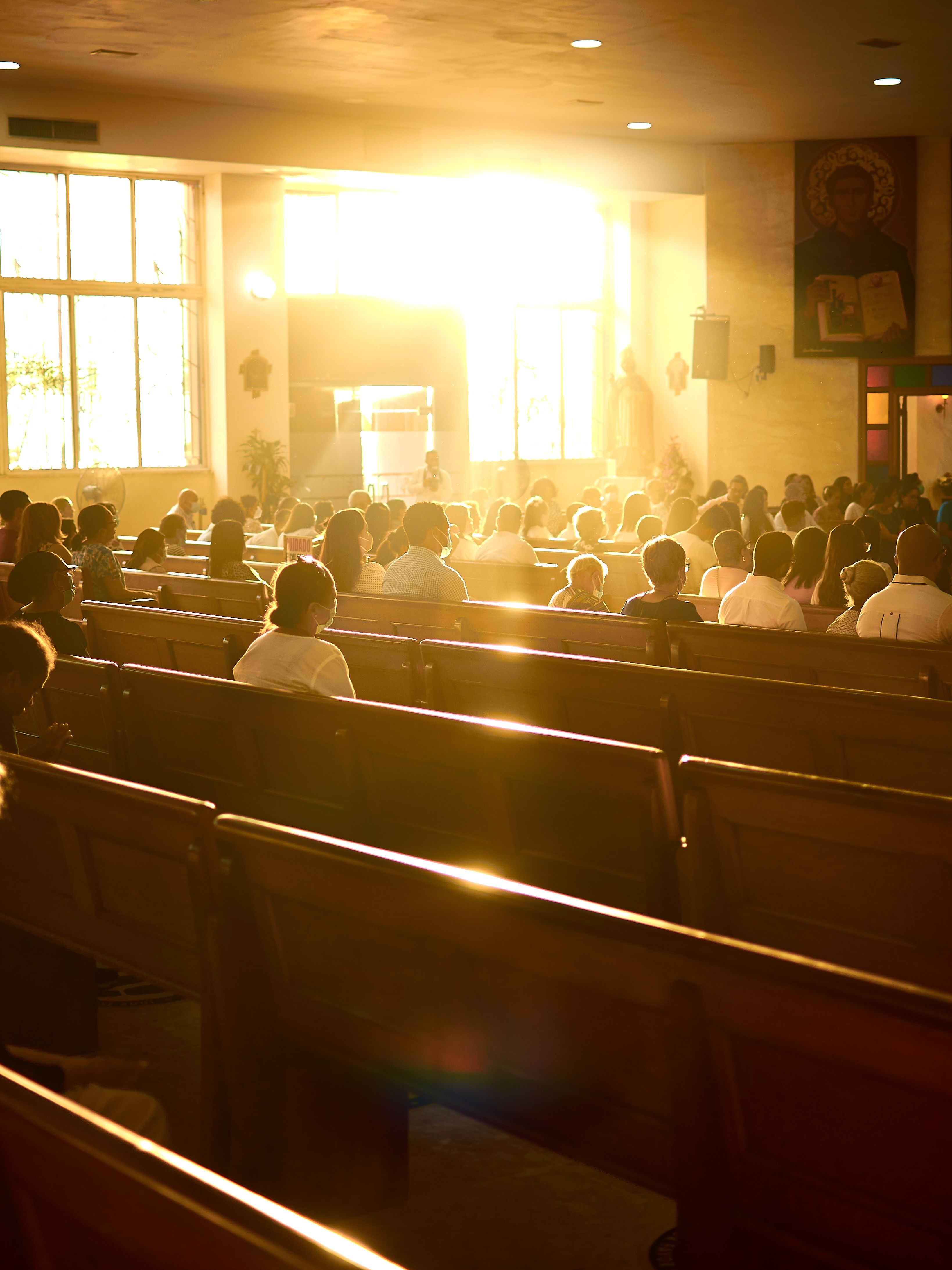
A church website has one primary reader: the person considering a first visit. They are not looking for theology, they are looking for safety signals. When exactly are services? Where do I park? What happens with children? Will it be obvious I am new? Pendro structures the site to answer those in the first minute, with times and location on the opening screen, a what-to-expect section written with warmth, and photographs of the actual community rather than stock imagery.
The second job is keeping the site truthful, which is where church websites tend to slip: the Easter times still up in June, the group that stopped meeting two years ago. Pendro makes currency a five-minute volunteer task. Edit in the browser, publish, and the design system keeps everything looking cared-for whoever does it. The announcement bar carries this week's notices, the newsletter reaches the housebound and the travelling, and pages for the food pantry rank for the neighbours searching.
Every plan starts free — see what each plan includes.
Church websites are overwhelmingly WordPress, and the comparison addresses the real failure mode rather than the feature list: a site nobody currently on the rota feels confident enough to change. Read the full Pendro vs WordPress comparison, or see how Pendro measures up against Wix, Squarespace and Framer.
Yes. Editing is filling in boxes in a browser, and the design system keeps the result looking consistent. Updating service times or adding an event takes about as long as typing the notice sheet, so it can sit with whoever is on the rota.
Link your giving buttons to whichever platform your church already uses. The site's role is the welcome, the information, and the community life, while the giving flow stays with your existing provider and its Gift Aid handling.
The free plan is a real, permanent site with services, what to expect, and contact details, at no cost. Congregations that want their own domain and more pages upgrade from $12 a month, which sits inside most parish budgets.
Say it plainly and say it early. Parents want to know where children go during the service and who looks after them. Disabled visitors want to know about step-free access, hearing loops, and parking before they set out, not after. A short honest paragraph on each removes a phone call people are reluctant to make.
Your site, bookings, leads and email, running in an evening, for free. The first customer who finds you pays for the rest.